Bento Cool
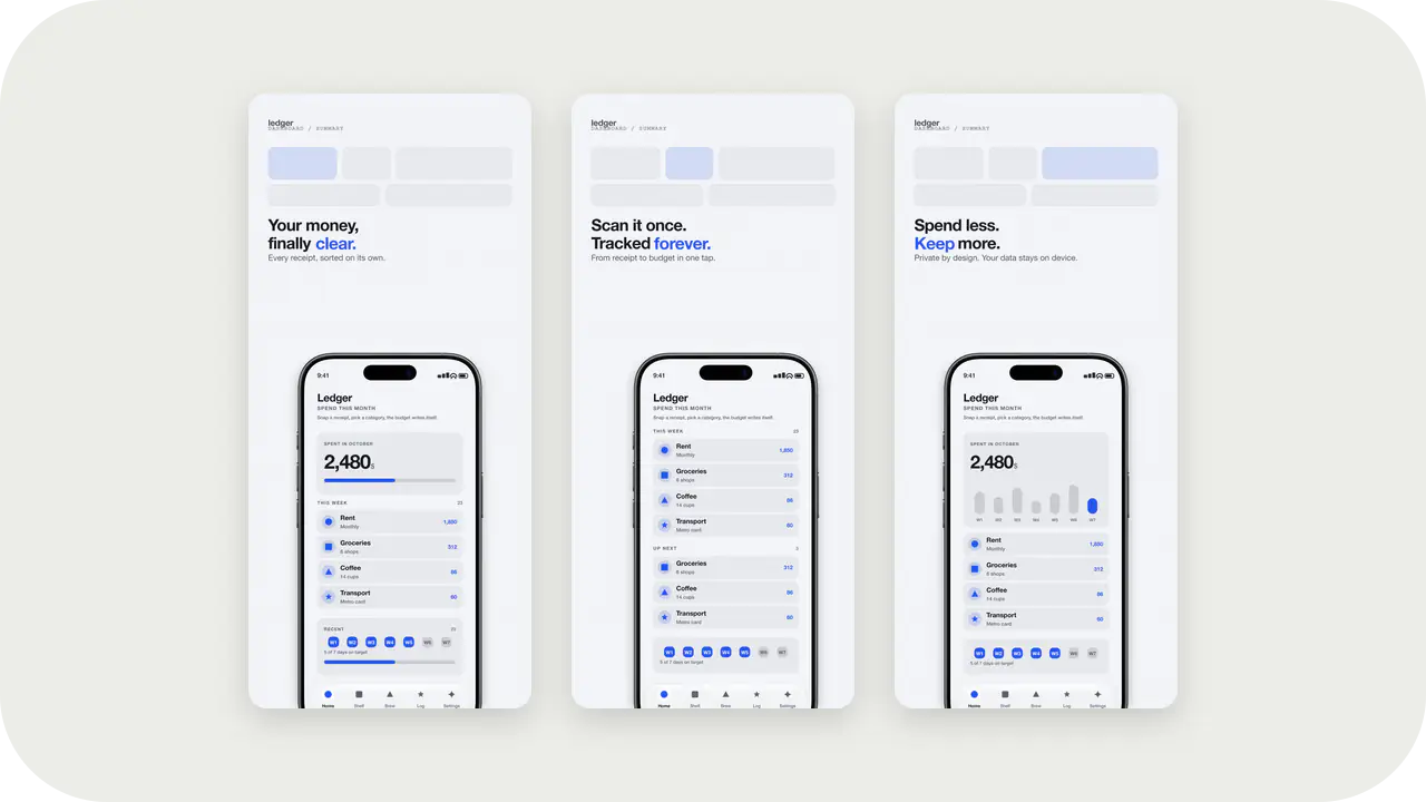
Bento Cool Launch Kit style. Same colors as the Bento Cool screenshot template: apply here for icons and splash, or open in the studio for store slides.
Launch Kit
Each style uses the same id and palette as a screenshot template. Apply it in Launch Kit for icons and splash, or open it in the studio for store slides.
Structured, grid-led looks for products that sell a workflow. These hold a feature list on screen without turning into a slide deck.
Bento Cool Launch Kit style. Same colors as the Bento Cool screenshot template: apply here for icons and splash, or open in the studio for store slides.
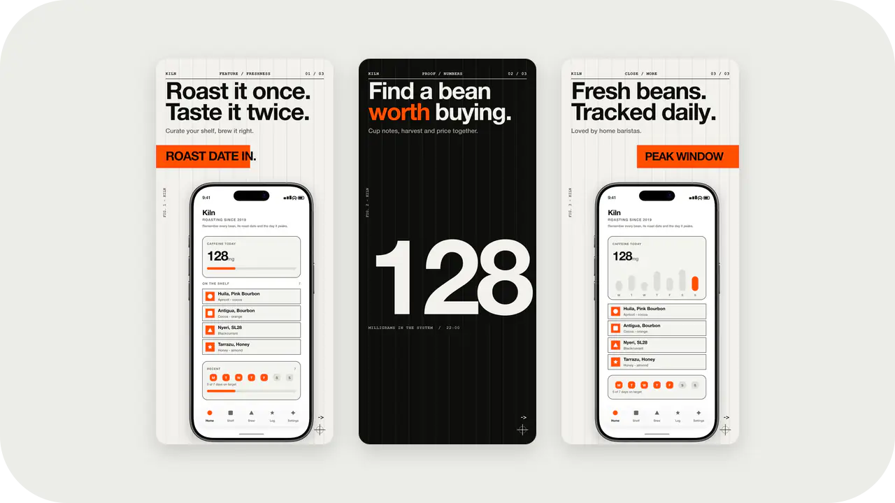
Paper ground and orange accent. Strong monograms for SaaS marks that also use Swiss Orange slides.
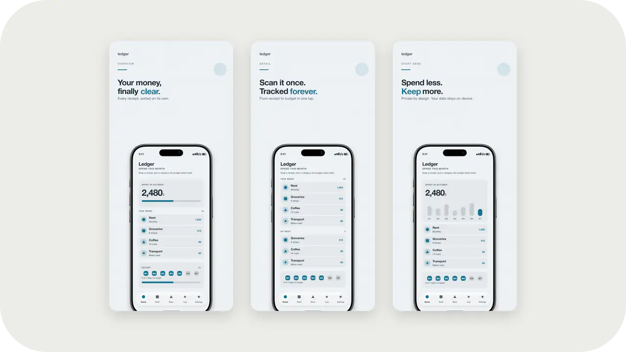
Arctic Slate Launch Kit style. Same colors as the Arctic Slate screenshot template: apply here for icons and splash, or open in the studio for store slides.
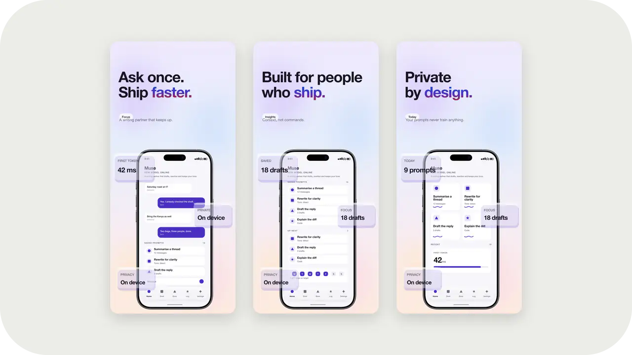
Glass Aurora Launch Kit style. Same colors as the Glass Aurora screenshot template: apply here for icons and splash, or open in the studio for store slides.
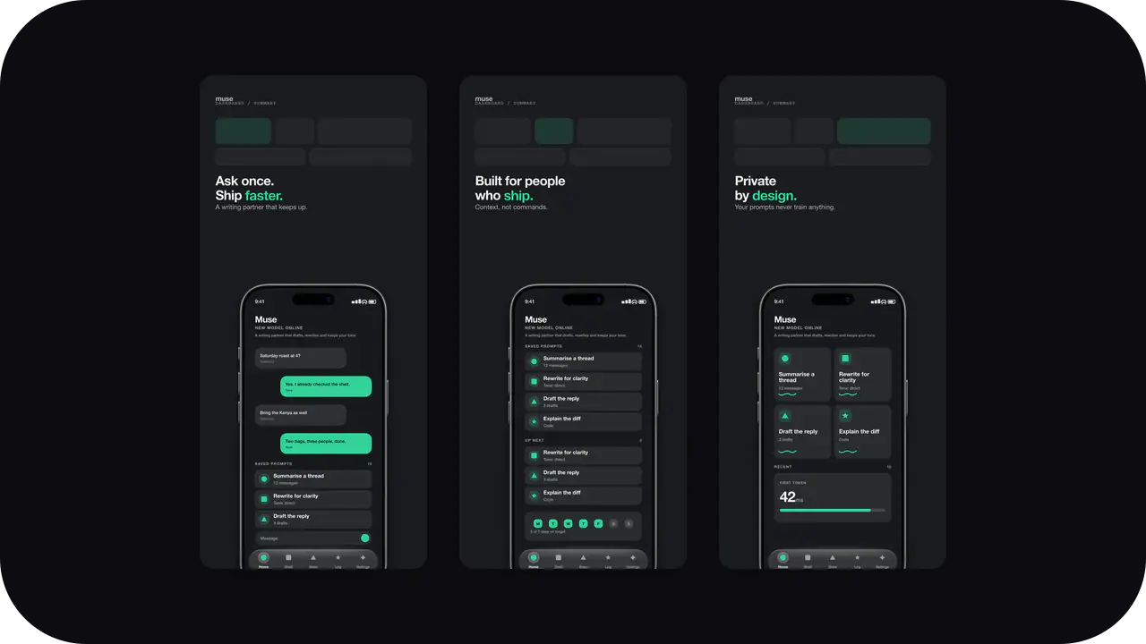
Graphite Mint Launch Kit style. Same colors as the Graphite Mint screenshot template: apply here for icons and splash, or open in the studio for store slides.
High-energy canvases with room for a metric, a streak, or a route. Built to survive the store grid next to every other workout app.
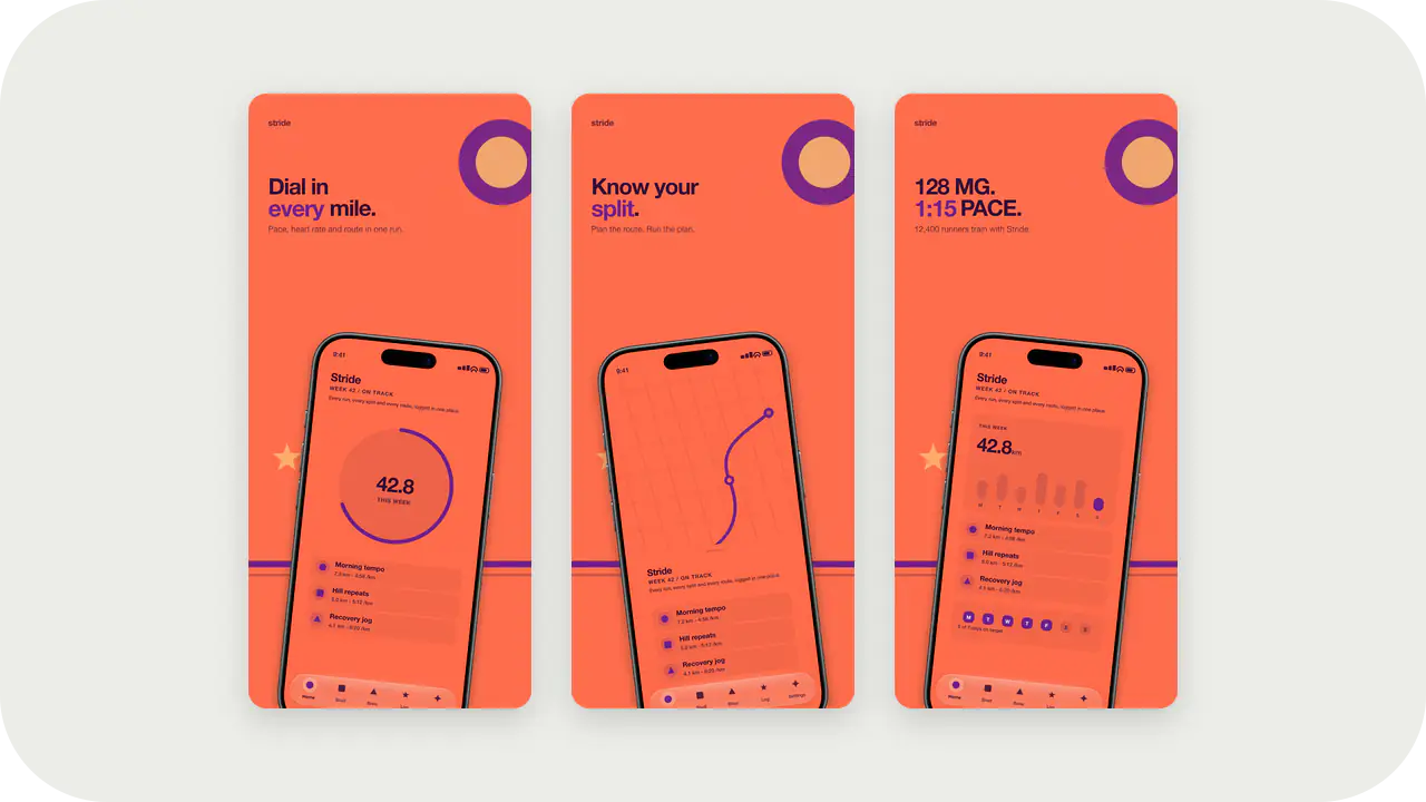
Sunset Pop Launch Kit style. Same colors as the Sunset Pop screenshot template: apply here for icons and splash, or open in the studio for store slides.
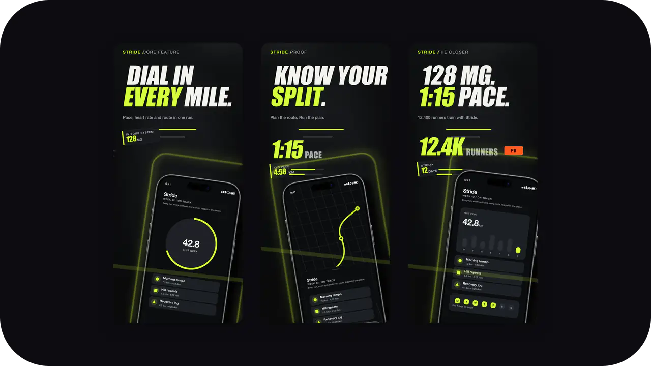
Neon Lime Night Launch Kit style. Same colors as the Neon Lime Night screenshot template: apply here for icons and splash, or open in the studio for store slides.
Restrained, trustworthy palettes. Money apps earn trust before they earn attention, so the type stays quiet and the numbers stay legible.
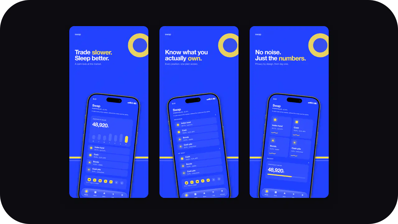
Cobalt Pop Launch Kit style. Same colors as the Cobalt Pop screenshot template: apply here for icons and splash, or open in the studio for store slides.
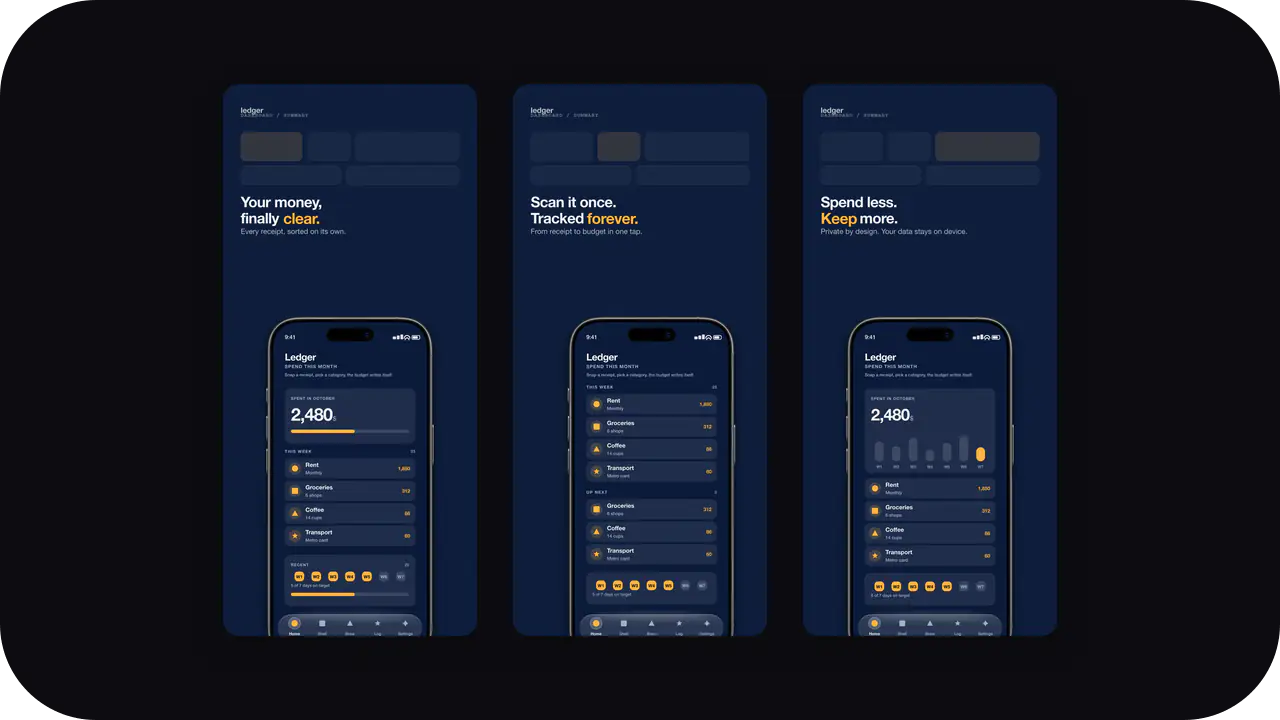
Ink Navy Launch Kit style. Same colors as the Ink Navy screenshot template: apply here for icons and splash, or open in the studio for store slides.
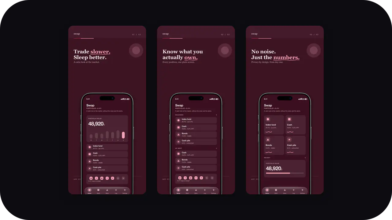
Wine Velvet Launch Kit style. Same colors as the Wine Velvet screenshot template: apply here for icons and splash, or open in the studio for store slides.
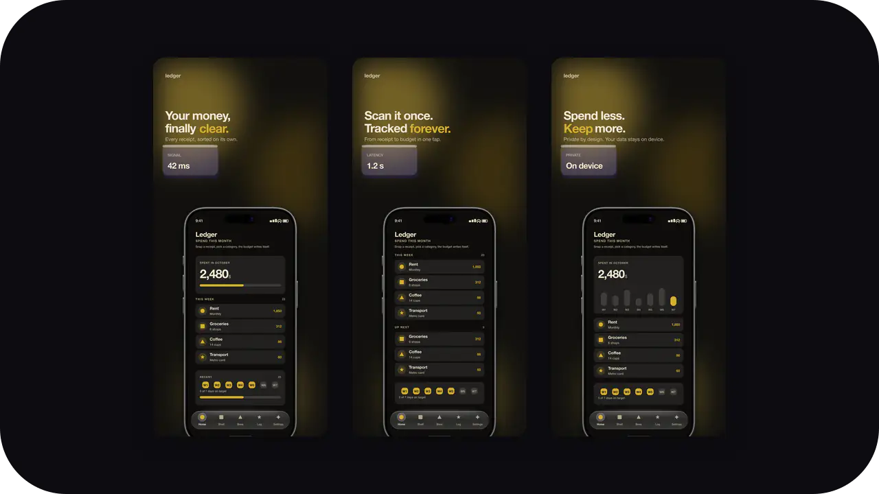
Obsidian Gold Launch Kit style. Same colors as the Obsidian Gold screenshot template: apply here for icons and splash, or open in the studio for store slides.
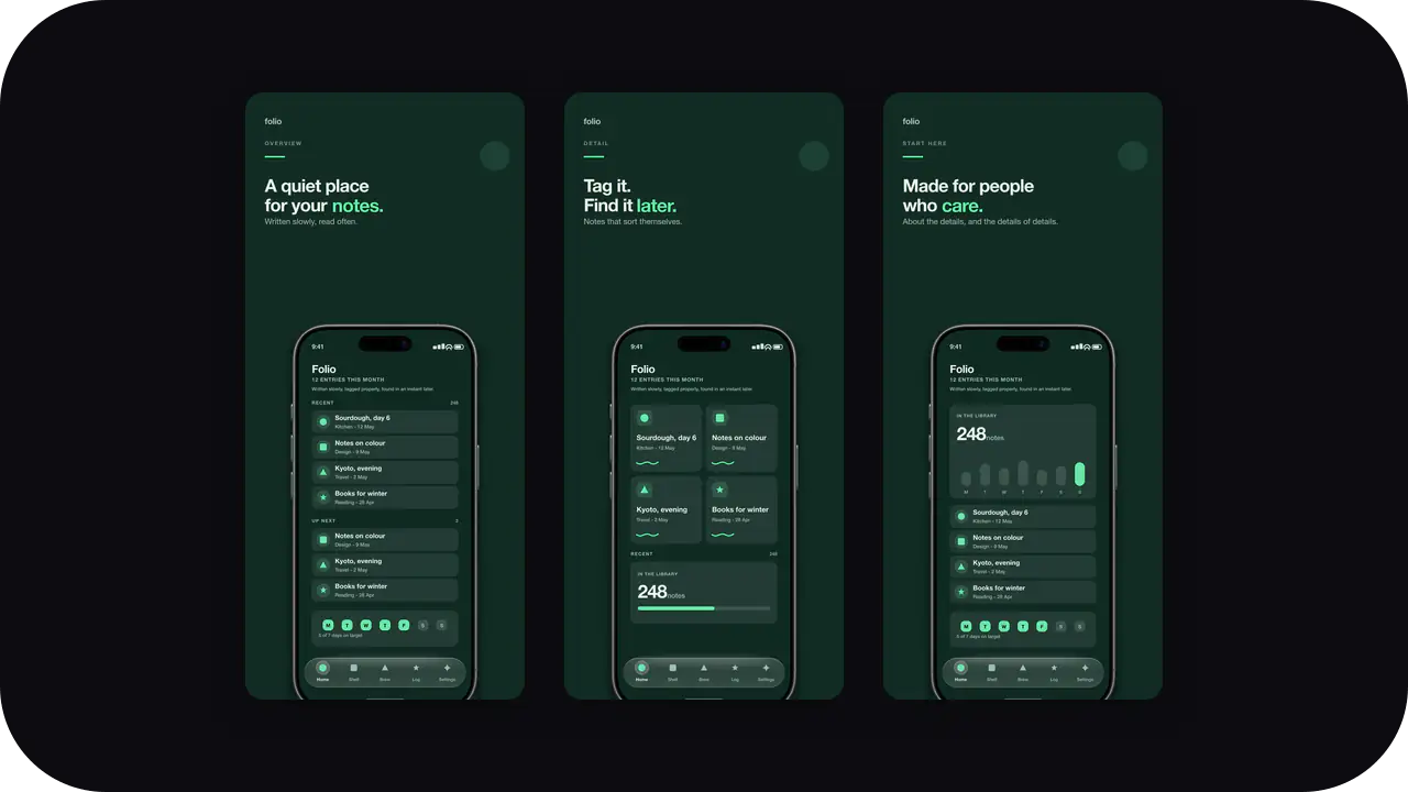
Deep Forest Launch Kit style. Same colors as the Deep Forest screenshot template: apply here for icons and splash, or open in the studio for store slides.
Dark, technical surfaces for products whose value is a model, a prompt, or a terminal. Signal over decoration.
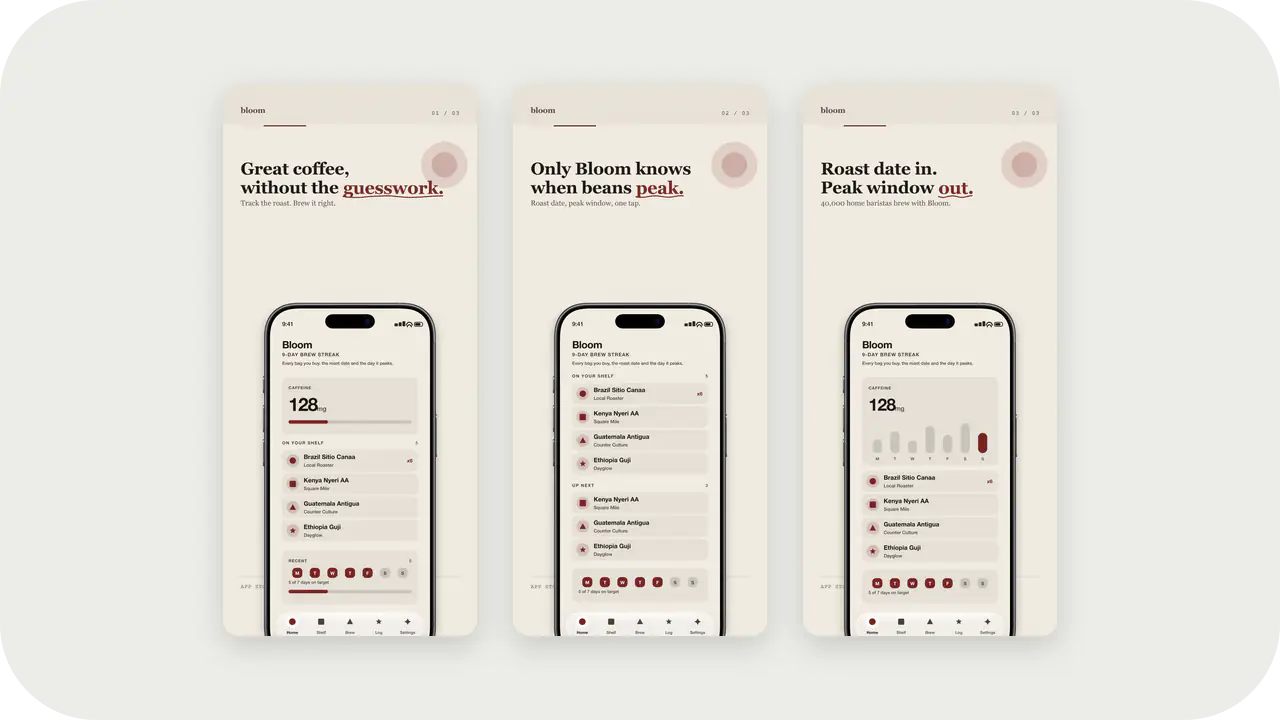
Cover Burgundy Launch Kit style. Same colors as the Cover Burgundy screenshot template: apply here for icons and splash, or open in the studio for store slides.
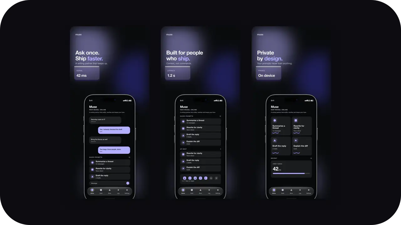
Midnight Glow Launch Kit style. Same colors as the Midnight Glow screenshot template: apply here for icons and splash, or open in the studio for store slides.
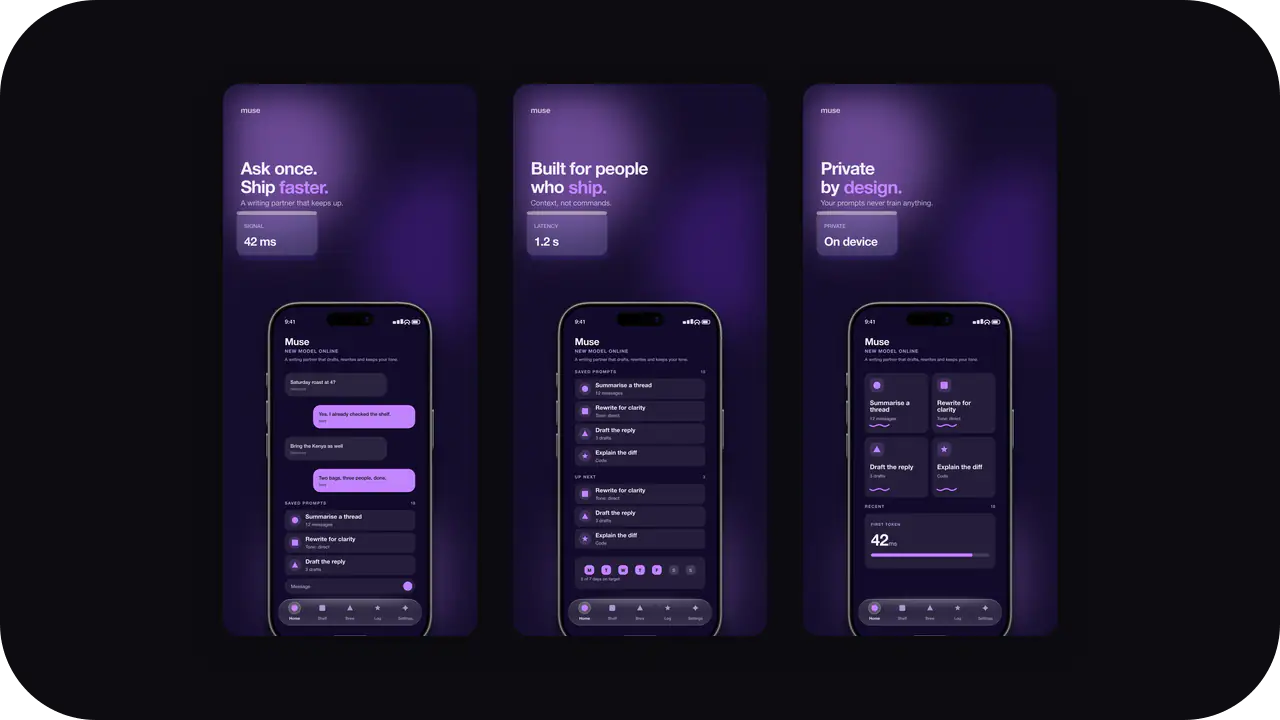
Cyber Violet Launch Kit style. Same colors as the Cyber Violet screenshot template: apply here for icons and splash, or open in the studio for store slides.
Poster-grade palettes for maps, trips, and destinations. One strong image and one claim per slide reads best here.
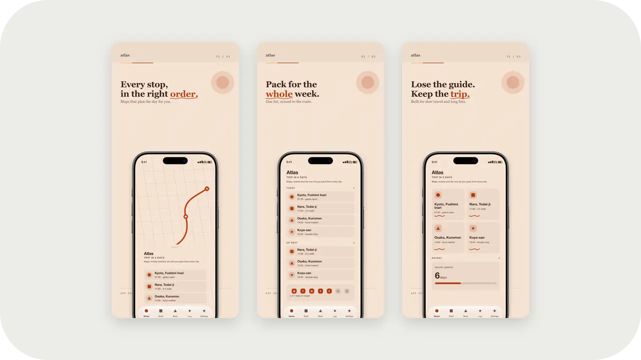
Terracotta Sun Launch Kit style. Same colors as the Terracotta Sun screenshot template: apply here for icons and splash, or open in the studio for store slides.
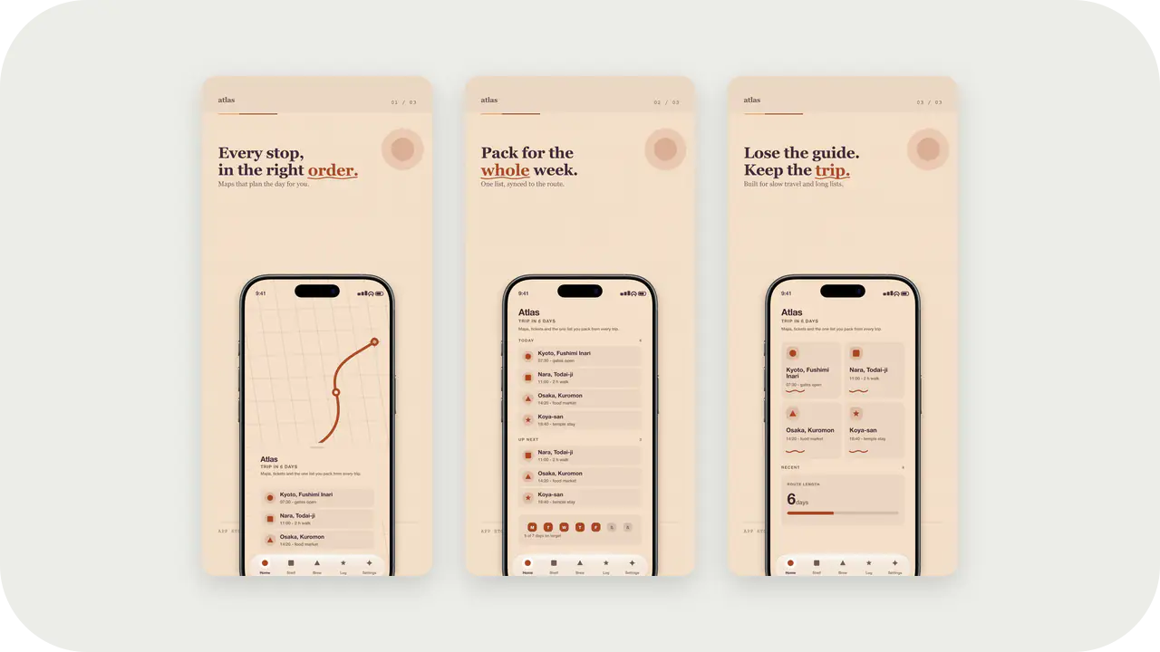
Desert Dusk Launch Kit style. Same colors as the Desert Dusk screenshot template: apply here for icons and splash, or open in the studio for store slides.
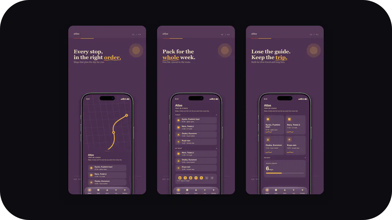
Vintage Plum Launch Kit style. Same colors as the Vintage Plum screenshot template: apply here for icons and splash, or open in the studio for store slides.
Paper-like, calm canvases for tools people use every day. Quiet enough to look native, distinct enough to look designed.
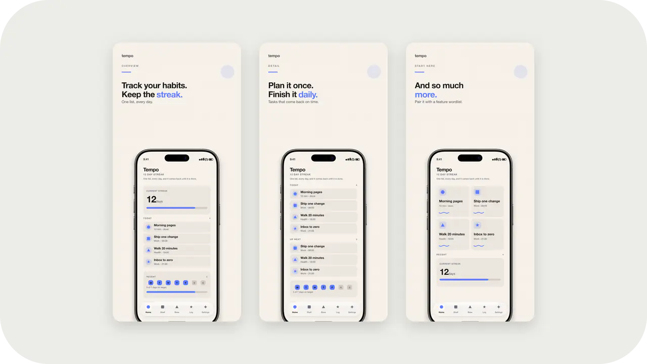
Warm off-white plate with a blue accent. Favicon, PWA, and app icons that match the Clean Light screenshot template.
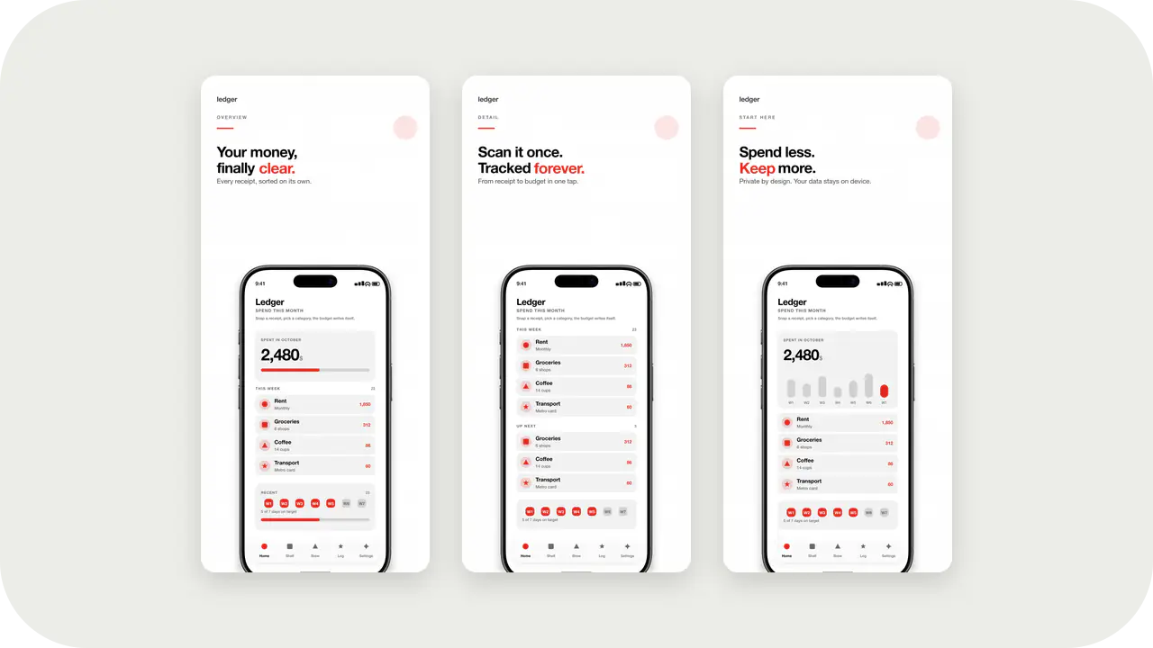
Black and white with a red accent. High-contrast icons that survive 16px tabs and store grids.
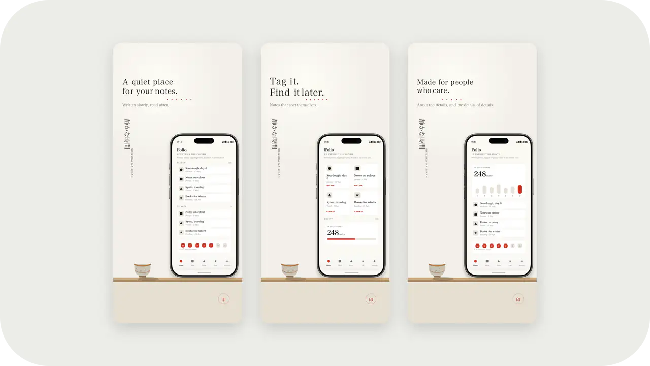
Stone Sage Launch Kit style. Same colors as the Stone Sage screenshot template: apply here for icons and splash, or open in the studio for store slides.
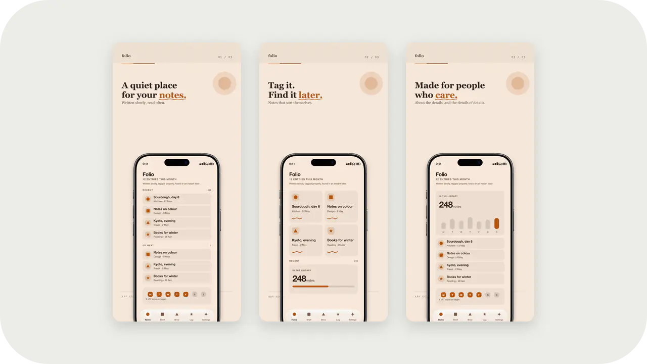
Sandstone Editorial Launch Kit style. Same colors as the Sandstone Editorial screenshot template: apply here for icons and splash, or open in the studio for store slides.
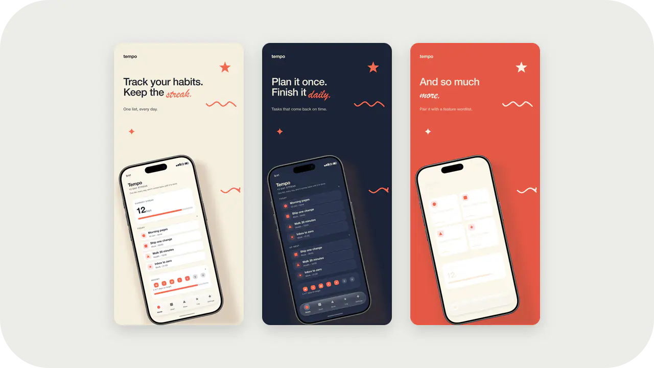
Hand-Drawn Ink Launch Kit style. Same colors as the Hand-Drawn Ink screenshot template: apply here for icons and splash, or open in the studio for store slides.
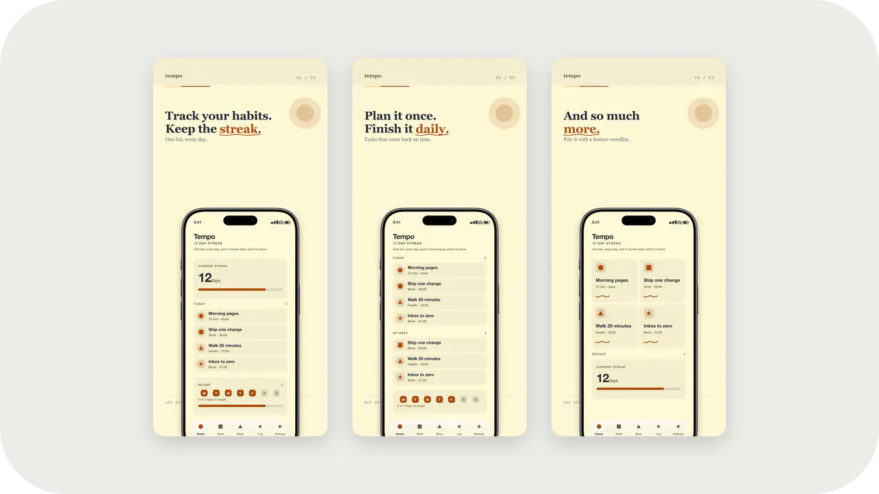
Lemon Zest Launch Kit style. Same colors as the Lemon Zest screenshot template: apply here for icons and splash, or open in the studio for store slides.
Loud colour and character-led layouts. Game listings are browsed, not read, so the first frame has to carry the idea.
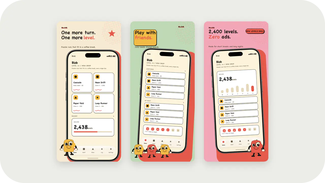
Retro Cream Launch Kit style. Same colors as the Retro Cream screenshot template: apply here for icons and splash, or open in the studio for store slides.
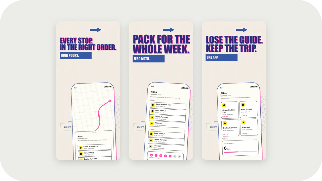
Risograph Zine Launch Kit style. Same colors as the Risograph Zine screenshot template: apply here for icons and splash, or open in the studio for store slides.
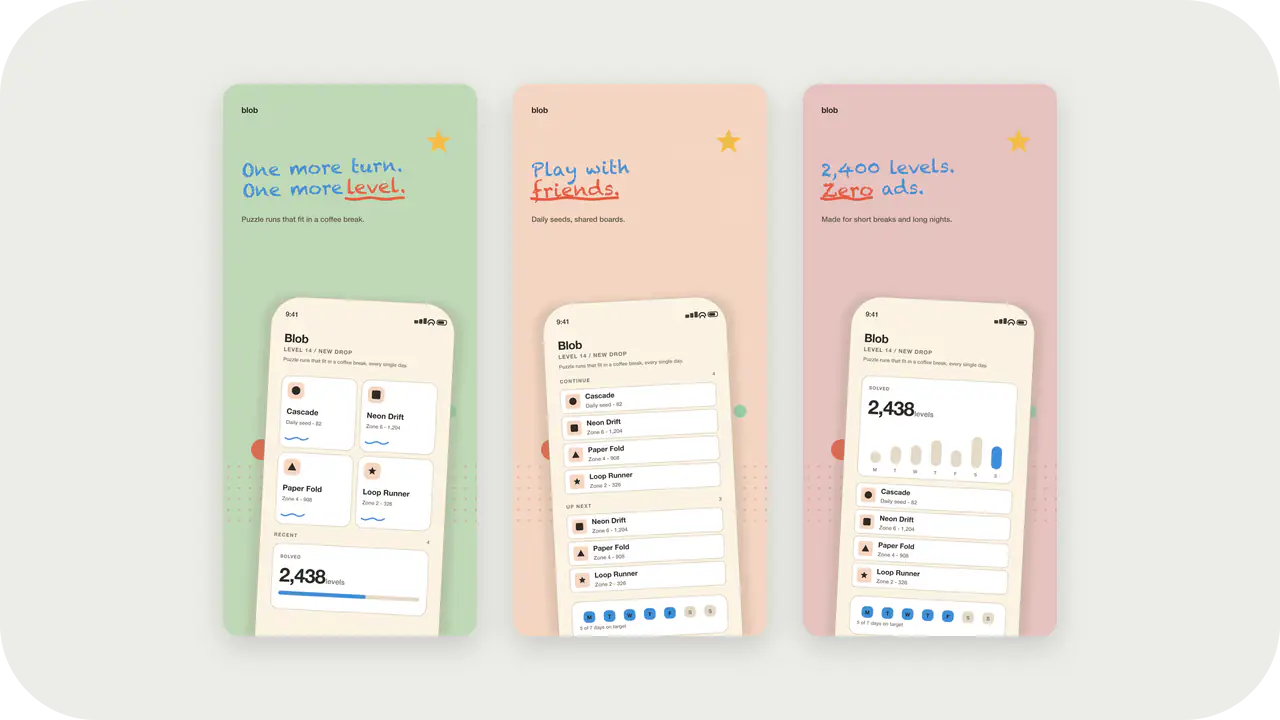
Paper Sticker Launch Kit style. Same colors as the Paper Sticker screenshot template: apply here for icons and splash, or open in the studio for store slides.
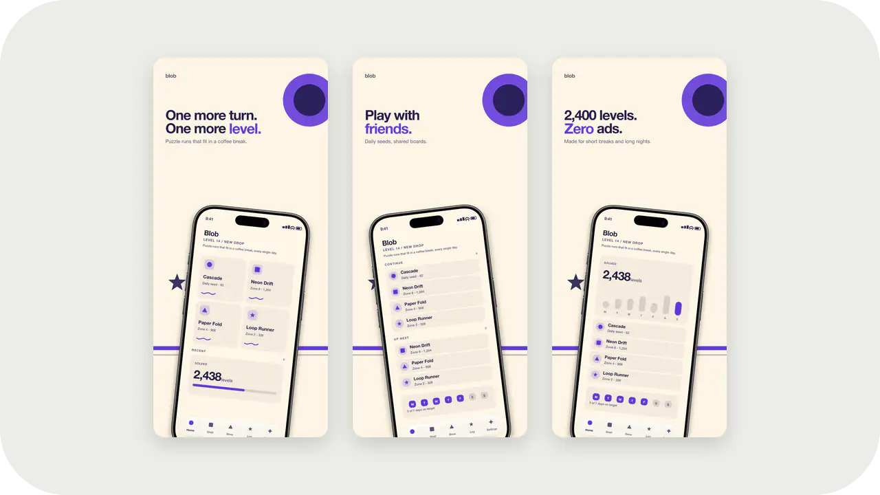
Toybox Primary Launch Kit style. Same colors as the Toybox Primary screenshot template: apply here for icons and splash, or open in the studio for store slides.
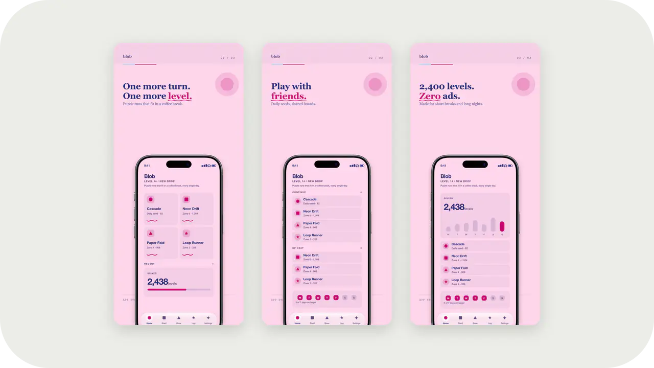
Bubblegum Sky Launch Kit style. Same colors as the Bubblegum Sky screenshot template: apply here for icons and splash, or open in the studio for store slides.
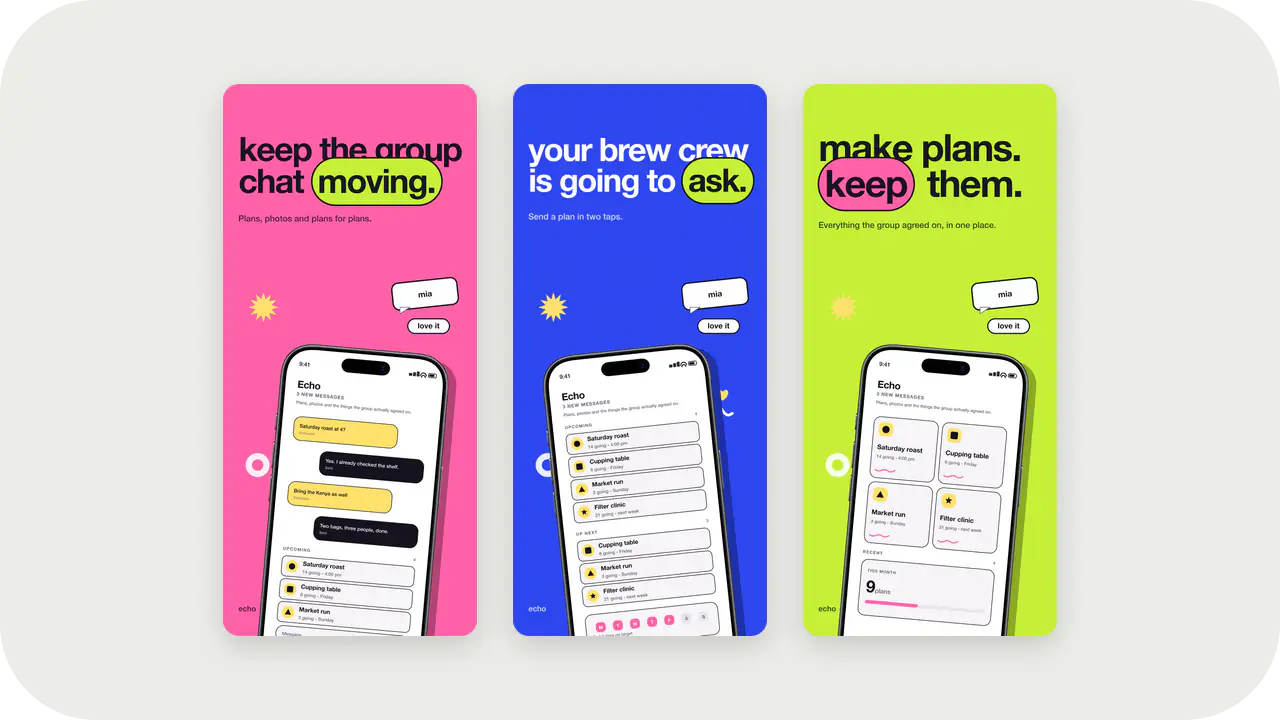
Candy Pop Launch Kit style. Same colors as the Candy Pop screenshot template: apply here for icons and splash, or open in the studio for store slides.
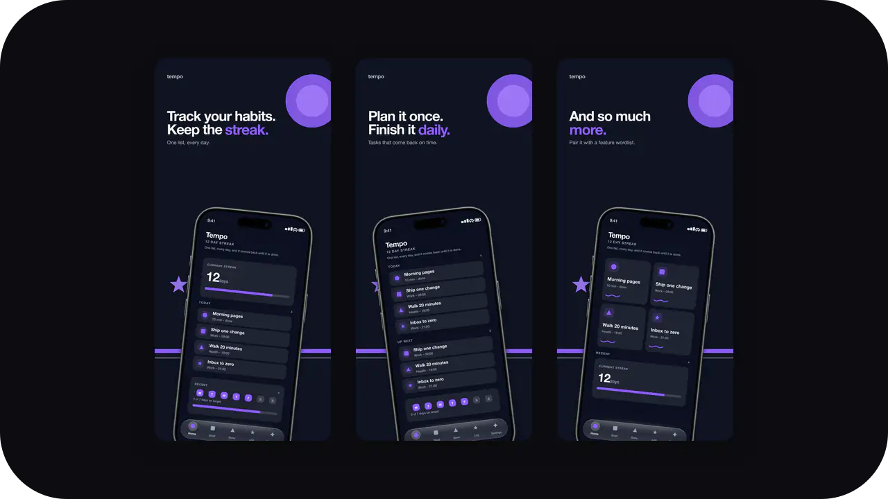
Night plate and bright accent for pro tools. Pair with the Dark Bold store screenshots so tab icons and listing slides share one system.
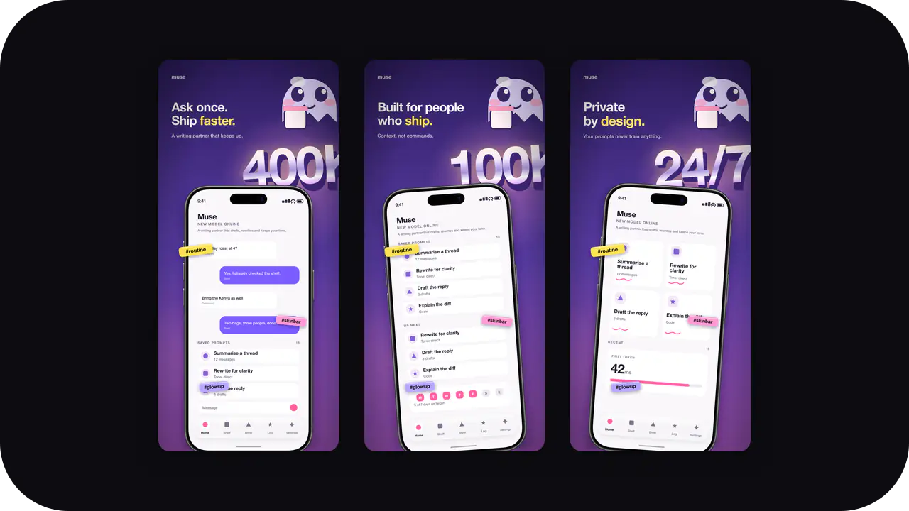
Glossy Orchid Launch Kit style. Same colors as the Glossy Orchid screenshot template: apply here for icons and splash, or open in the studio for store slides.
Soft, breathable palettes for health, fitness, and habit apps. Warm without tipping into a medical look.
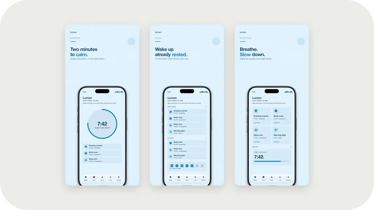
Cool blue fill for health and travel marks. Same Ocean Fresh palette as the screenshot deck.
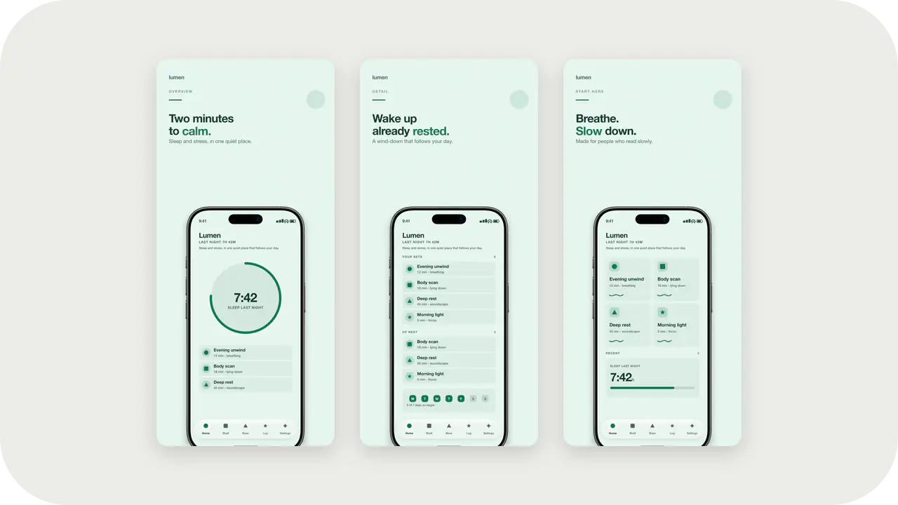
Mint Breeze Launch Kit style. Same colors as the Mint Breeze screenshot template: apply here for icons and splash, or open in the studio for store slides.
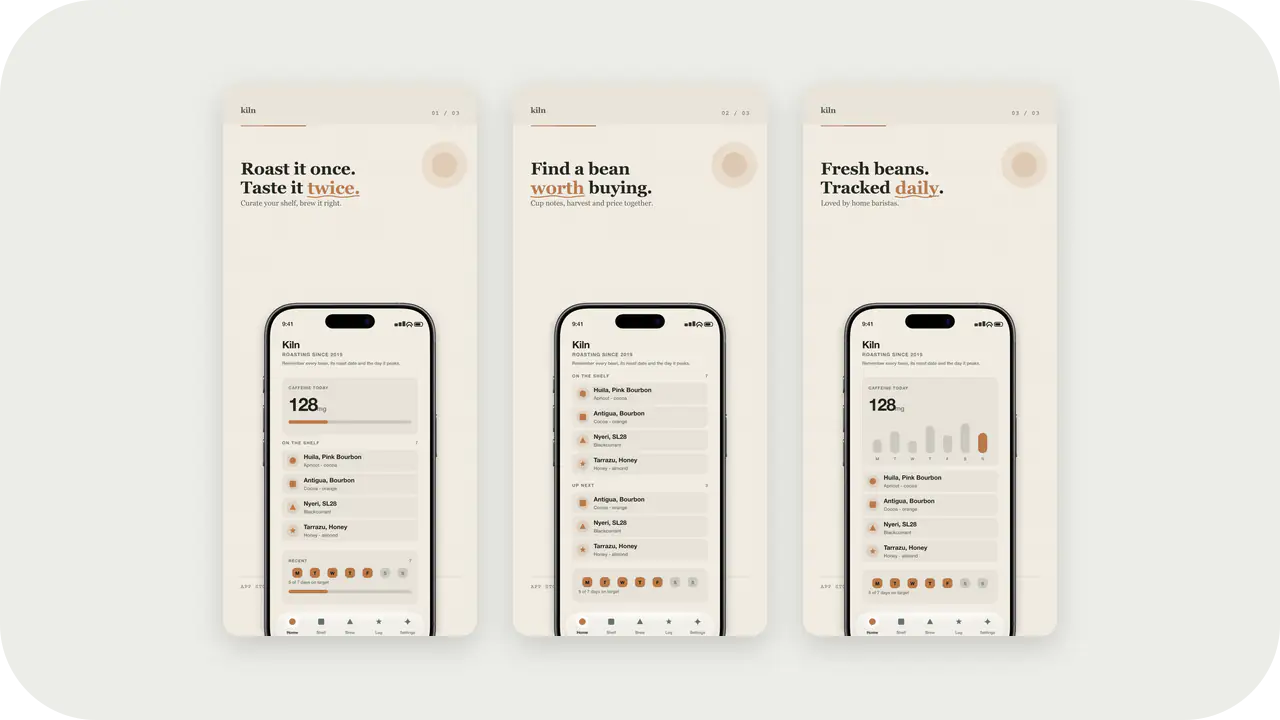
Bloom Roast Launch Kit style. Same colors as the Bloom Roast screenshot template: apply here for icons and splash, or open in the studio for store slides.
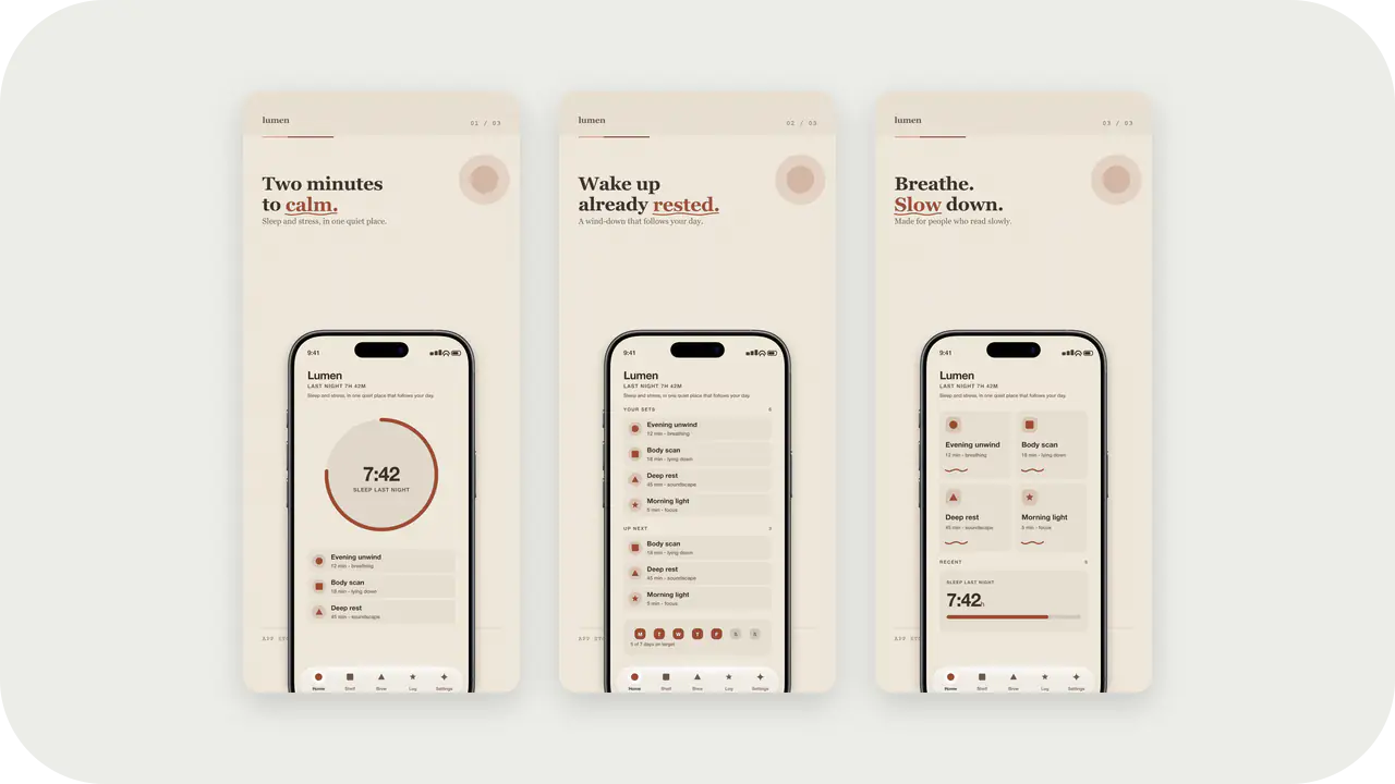
Soft Clay Launch Kit style. Same colors as the Soft Clay screenshot template: apply here for icons and splash, or open in the studio for store slides.
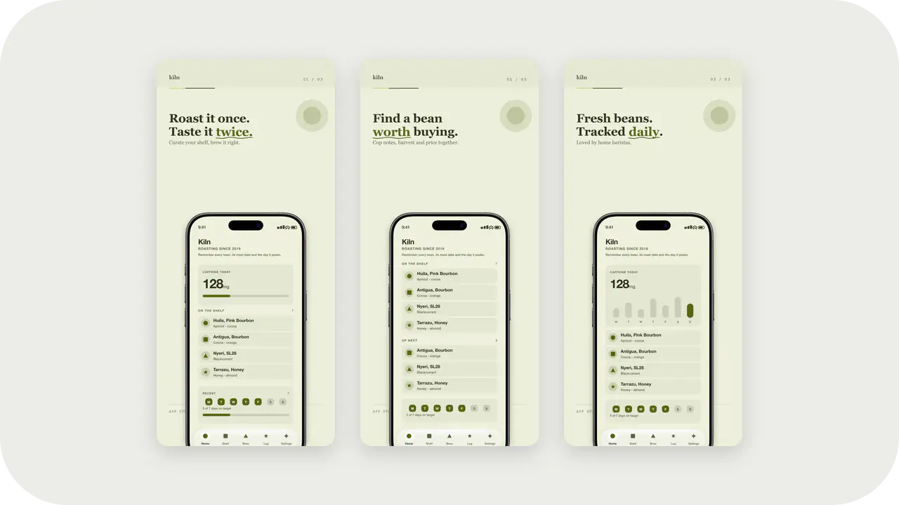
Olive Grove Launch Kit style. Same colors as the Olive Grove screenshot template: apply here for icons and splash, or open in the studio for store slides.
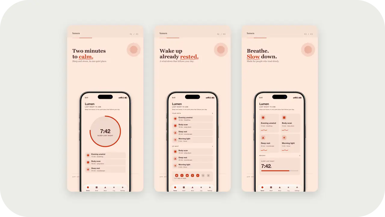
Peach Sorbet Launch Kit style. Same colors as the Peach Sorbet screenshot template: apply here for icons and splash, or open in the studio for store slides.
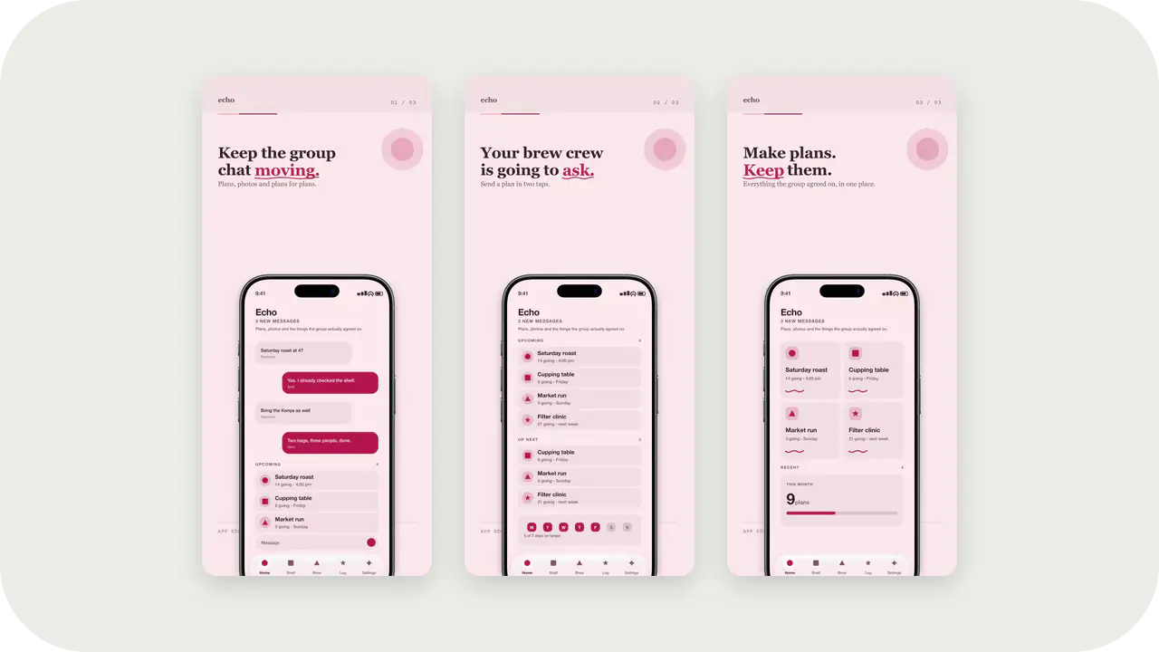
Rose Quartz Launch Kit style. Same colors as the Rose Quartz screenshot template: apply here for icons and splash, or open in the studio for store slides.
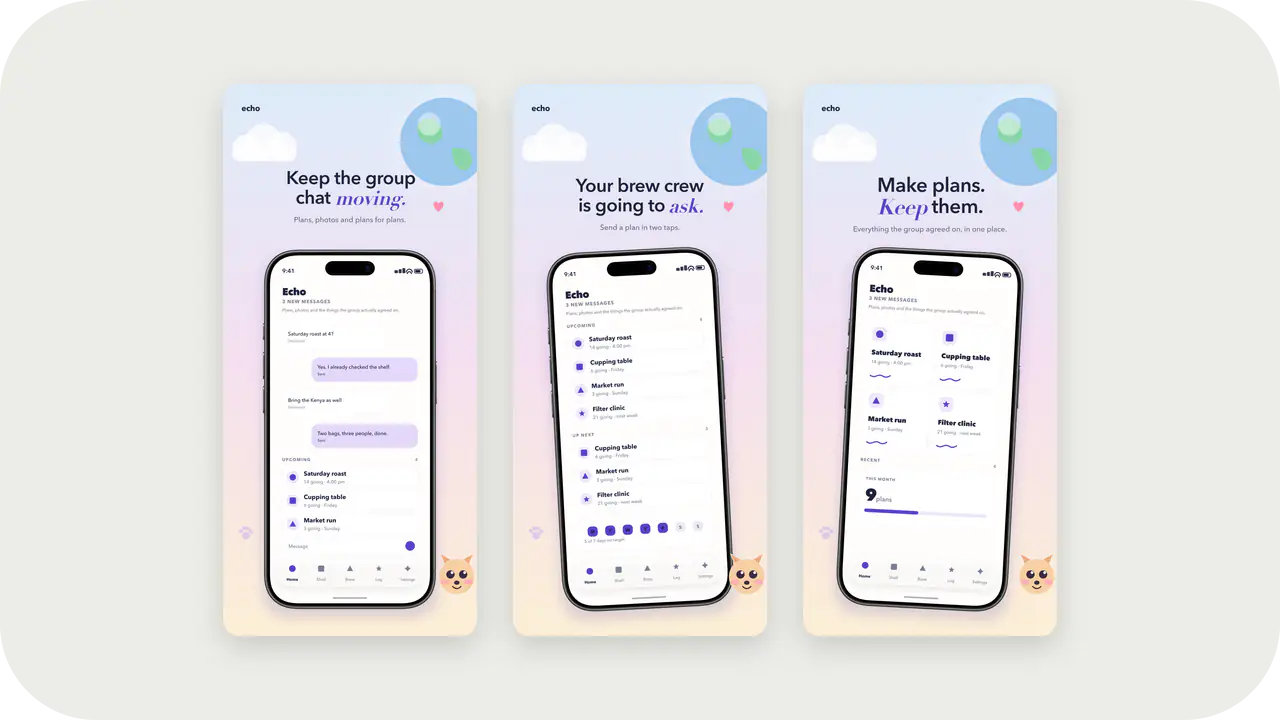
Dreamy Pastel Launch Kit style. Same colors as the Dreamy Pastel screenshot template: apply here for icons and splash, or open in the studio for store slides.
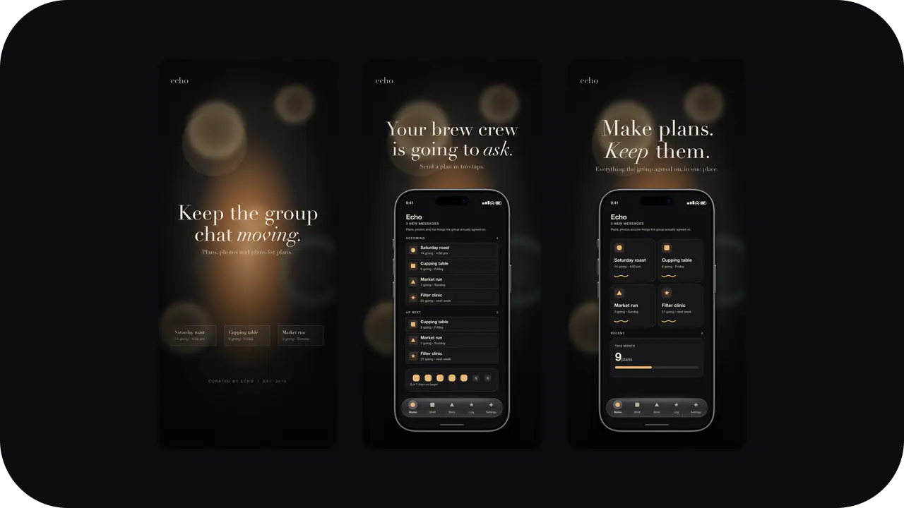
Moody Amber Launch Kit style. Same colors as the Moody Amber screenshot template: apply here for icons and splash, or open in the studio for store slides.