Guide
Dark mode app icons: when and how to support them
October 18, 2026 · 3 min read
Appearance-aware icons can make an app feel at home in system themes, but platform support and implementation details differ. Decide which variants your app supports, then validate them on the target operating systems.
Check what each platform supports
iOS appearance options and Android themed-icon behavior use different asset and implementation models. Review current platform documentation and your deployment targets before designing variants.
Preserve recognition across versions
Keep the main silhouette and brand cue recognizable in every appearance. A dark variant can adjust contrast and background treatment without becoming an unrelated mark.
Test contrast and system rendering
Preview each version against the backgrounds and masks the operating system can apply. Android themed icons may be tinted by the system, so test whether the design remains legible after that treatment.
Include a safe fallback
Make sure the default icon remains clear where appearance-aware assets are unsupported or disabled. Check how the app looks across the oldest supported OS versions as well as current devices.
Keep store marketing assets intentional
The icon shown in a store listing may follow different rules from the icon rendered on a device. Confirm which asset belongs in each destination instead of assuming every appearance variant should be uploaded as store artwork.
iOS appearance variants and Android themed icons differ
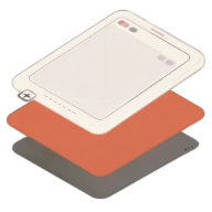
Apple’s current Icon Composer workflow supports default, dark, and mono icon appearances for compatible platforms. Android adaptive icons use foreground and background layers, with an optional monochrome layer for supported themed-icon surfaces.
These variants are not a single interchangeable dark-mode file. Follow each platform’s asset model, operating-system support, and project configuration, then preview how the system combines or tints the artwork.
Build a coverage matrix before release
List the platform version, appearance, launcher or store surface, and expected fallback for each target. This catches cases where the device uses the default icon even though the design team reviewed only the newest dark appearance.
Check both light and dark wallpapers, monochrome tinting, and disabled themed icons. If the mark relies on a particular hue to remain identifiable, adjust its shape or tonal contrast as well.
Design contrast rather than simply inverting colors
A dark variant should preserve the hierarchy of foreground and background. A literal color inversion can create weak contrast, shift the brand meaning, or make a light mark disappear when the system adds its own appearance treatment.
Check the full icon under the actual OS appearance controls, including system tinting for Android monochrome icons. A static mockup in a design tool does not reproduce every launcher’s rendering.
Include fallback devices in review
Test the default asset on OS versions that do not support the appearance variant, and on devices where users have disabled themed icons. The fallback is still part of the released product and should not be treated as an obsolete version.
Record the minimum supported OS and the icon resources included in the build. This gives QA a precise list of the behaviors to verify before release.
Record the tested combinations
Write down OS version, appearance setting, launcher, and icon variant for each check. This makes a visual bug report actionable when one device shows a system-tinted icon and another uses the normal color asset.
Revisit the matrix when you raise the minimum OS version or adopt a new icon format. Platform behavior can change while the source artwork stays the same.
Create a matching listing style
Use a consistent palette across store screenshots while keeping each platform icon asset distinct.
Open App Snaps